
Bitcoin has clocked one of the worst months in its history, with prices trading down -37.9% in the month of June itself. Even the Bitcoin Network has registered a drastic change in daily active users.
There has been a massive expulsion of paper hands in the market, leaving only long-term hodlers in the market.
For a sense of scale, Bitcoin competes with 2011 prices, when it was $10.
This week, Bitcoin prices have maintained a trading range around 2017, $20,000 all-time-high.
The US inflation estimates for June were pretty hawkish. With the storm clouds of an upcoming recession looming, the markets remain risk-off.
Bitcoin Network’s Active Addresses
Starting with the most visible on-chain activity: The number of Active Addresses.
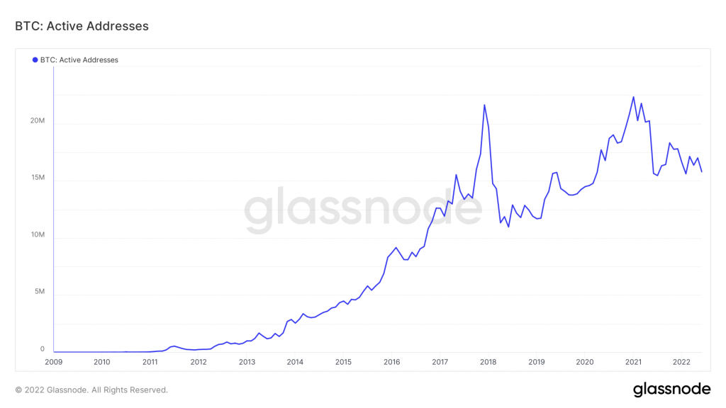
Any high activity is being matched in tandem with the infusion of new addresses and increased demand. In contrast, low activity means reduced demand, fading interest, and ongoing bear markets.
Active addresses have taken a 29% plunge from January 2021 highs till today. (Active Addresses)
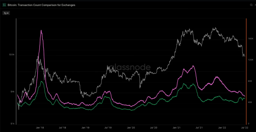
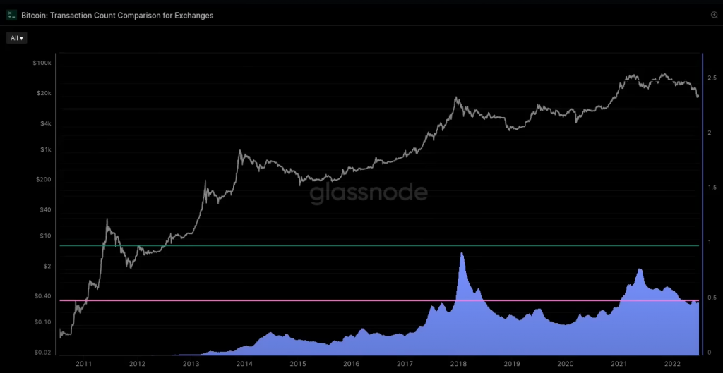
Transaction Counts in Bitcoin Network
Another Important metric is Transaction Counts. The number of settled transactions allows insights into the demand for the block space and the network utilization on any given day.
Currently, transaction counts remain stable within the activity channel. This infers a new demand stagnation while retaining the current user base. (Pic)
The Exchange Activity
Carrying on with the new theme—Exchange Deposits and Withdrawals—the number of them tends to show a high degree of sensitivity and correlation with the spot prices.
It is observable that there is a divergence between deposits and withdrawals. This could be in relation to two essential things: newfound caution amongst the general masses and the relative self-custody of their digital assets.
This causes withdrawals to increase and deposits to reduce.
Exchange Domination Matters
Evaluating the pair of deposits and withdrawals against entity-adjusted transaction counts gives exchange-related data.
Exchange dominance reaches its apex immediately post bull market tops. When dominance reduces, the HODLer-dominated regime starts to function in the limelight.
The 2017 cycle peaked at 94% of all activity dominated by exchanges, while 2021 with 80% dominance. Presently, the dominance is resting at 50% levels.
When Bitcoins are never spent
Now basically, an illiquid wallet is one with technically no history of spending. At the same time, the long-term and short-term hodlers have a probability of spending associated with it. In other words, it’s the likeliness of how often a wallet would spend its coins.
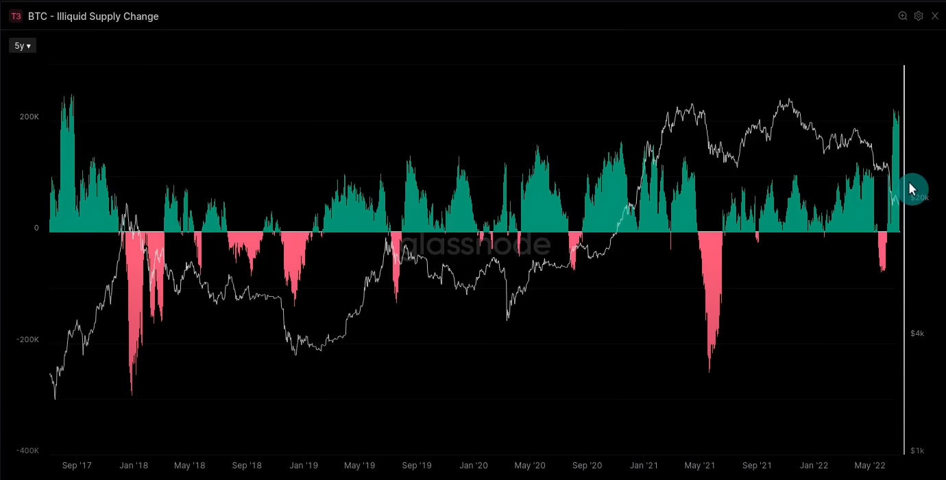
At $20k prices in 2017 and 2022, the area showing the increase/decrease to illiquid supply is entirely opposite.
Despite the worst monthly price action since 2011, the ratio of addition to illiquid supply increases compared to other bear markets.
Whales are accumulating again!
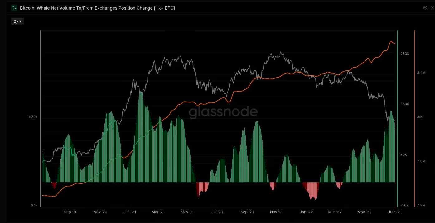
Factually, Whales are being considered an entity with 1K+ BTC holdings. Notably, as the price falls, the whales start to accumulate around the initial phases of a bull market. Then they soften around bull tops. At the same time, they are increasing to get during distress.